Sylvain Boyer: How I Designed the Paris Olympic Logo

The story of the Paris Olympic logo goes back to 2018 when Sylvain Boyer watched his city change before his eyes. All images courtesy of Sylvain Boyer.
Way back in 2018, anyone in the world who could write and speak French was able to participate in a competition to design the logo for the 2024 Paris Olympics. Sylvain Boyer, the founder of Ecobranding and its partner agency, Royalties, participated in the creative exercise to represent his roots as a Paris-based artist.
Boyer knew he wanted to represent French culture and do something that had never been done before. But his team never imagined they would win. “We were just a small, young company, not a big advertising group,” he said. “On paper, we were not the type to win a competition like this.” And yet they did win.
Now, Boyer’s logo — which is either a woman’s face or flames, depending on how you view it — will be seen by billions. One year after the logo reveal, the Paris Olympic Committee announced a total parity between male and female participants, with 50 percent of this year’s athletes being women — a historic first! (In Los Angeles in 1984, only 23 percent of the participants were women, and in Tokyo 2020, only 48.8 percent.)
Here, Boyer takes us inside his process of designing the emblem, including the underdog story of how he did it inside his Paris apartment, part of the backdrop of the city’s protests; why we need the Olympics today more than ever; and what it means to create a logo that can elicit so many reactions around the globe.


See the logo come to life.
This is the first Olympic logo with a woman on it. Take us back to how you made that decision.
When we first designed the logo in 2018, Paris began seeing a greater movement for social equality for women. We saw this movement everywhere, from the streets of Paris to TV to cinema. Every week in 2018 there was a strike for a social cause, whether it was a women’s march or Fridays for the Future.
In this environment, I started drawing these designs with the initial idea of making a moniker that represents sports in Europe. But this type of imagery is always one of a male’s performance. We wanted to do something different. We thought, What happens if we take a woman’s face and put it in the performance arena? And so the shock, the semantic shock, comes from that. Our country has an allegory, Marianne, who is the symbol of democracy and the Republic. In fact, we see a lot of women's allegories all over the world — think of the Statue of Liberty, for instance. When we designed our logo, we jumped off of our country’s cultural context and historical legacy.
Paris was an important city to make this choice because it was the first city where women participated in the Olympic Games, exactly 100 years ago. When we presented it for the first time to the Olympic Committee, we showed a survey showing the remarkable evolution of female participation in the Olympics since 1924. It got everyone excited. But this choice was a more interesting one for the Olympic Committee than it was for us — because it was the Olympic Committee who decided to be represented by a woman. Today, it’s still a delicate subject matter.

Boyer pitched their logo to the Olympic committee with his friend and associate, Olivier.
Did you expect it to get the response that it did?
We knew before revealing it that it might be an offense to some people. But I was not prepared for what it was like. It was a huge conversation through the media. Within 24 hours of revealing it, there were about 500 press releases about it. On social media, we saw so many mixed reactions. I don’t use social media, and people told me, “Don’t go on Twitter.” But I was too curious. All of the violence online was weird and new to me. Looking back, I feel like it was a good experience because it changed how I do my job today. It’s a good thing that a logo can elicit so many reactions, and it makes it even more popular. I’m sure this logo will have an impact on the story of the Games.
It is even more important to have this logo now than when I designed it six years ago. As a designer, you design for the future. Back then, I couldn’t have imagined what the world would look like today. Usually, when you think about the future, it’s always about a more positive future. So I didn’t imagine the pandemic, financial crisis, or the European emergency with Ukraine and Russia. Today, we need the Olympics now more than ever, because the Games have a clear promise. It’s the promise of peace.

Like La Garconne, the woman depicted on the logo had red lips in the early design stages.
This logo personifies a non-human thing. With this, you have the flames and the lips to make it look like a human. Why did you choose to go this route and what effect do you think it has?
In the beginning, the idea was to make a female logo, and in fact, it used to be more feminine than it is today. We first designed it with red lips, but the Olympic Committee said we had to change that. A lot of people only see the flames and they don’t see a woman when they first look at it, and that used to bother me, but today I like that. It’s like a game of perception. If you want to see only the flame, you see only the flame. If you want to see the woman, you see the woman. If you want to see a gold medal, you see a gold medal.

“You can see me going through a riot with a stroller and a child in my arms. It was during this period that I drew the Paris 2024 logo. In front of the flames, literally.”
Where did you design this?
I designed this logo in many places in France. To be transparent, when I entered this competition, I had just started my own company so I didn’t have an office. It was remote working before remote working was a thing. I designed it in Paris, in Brittany, in Corsica — wherever I was going I was working on it. That element makes it a French logo, not just a Parisian one. I wanted it to be more than just aesthetic — it needed to be a sign of community.
I started the project in my apartment with my wife and daughters, then with my friends and associates, Olivier and David, from the Royalties agency. I never imagined we would win. It’s magic, and it’s a great story to make something outside the office with traditional brainstorming sessions and have it turn into something like this.
What influenced your work here?
One artist I love is René Gruau. He was a fashion illustrator and drew designs depicting human faces. With only two brush strokes, he could draw a woman’s face. I was impressed by that, so I decided to go by simplicity with a minimal design. The organization of the Paris 2024 Olympic Games wanted to create sober games, meaning they didn’t do major works such as building an Olympic stadium, and instead, they reused existing infrastructures, such as fencing at the Grand Palais or horse riding at the Château de Versailles. I wanted this sobriety in the organization of the Games to be found in the brand, too.
The type came after the emblem.
What is your personal favorite Olympic logo?
That’s funny, the Olympic Committee had the same question for us when we pitched our designs to them. I love the logo from the 1968 Olympics in Mexico, but I would have to say London 2012 is my favorite because it had a big impact, which is to say that it sparked a huge controversy. I love it for that reason. It was a rupture of everything they had done before. When I saw their logo and the font, I saw a way to make branding that I had never seen before. It was different from the brand designs that we used. You know, the reference was Apple design: simplicity and purity. And they brought with it this kind of fruitive spirit. It was aggressive for the eyes. It was shocking, like a punch in the face. They brought punk culture into it, too. London 2012 radically changed the way we made branding.
Why do you attach yourself to logos?
You know, we speak more with logos than we do with words and text. Logos are everywhere, when you send an emoji, or see an interface when you connect to WiFi, or send a message with Siri through the microphone. Logos are our language.
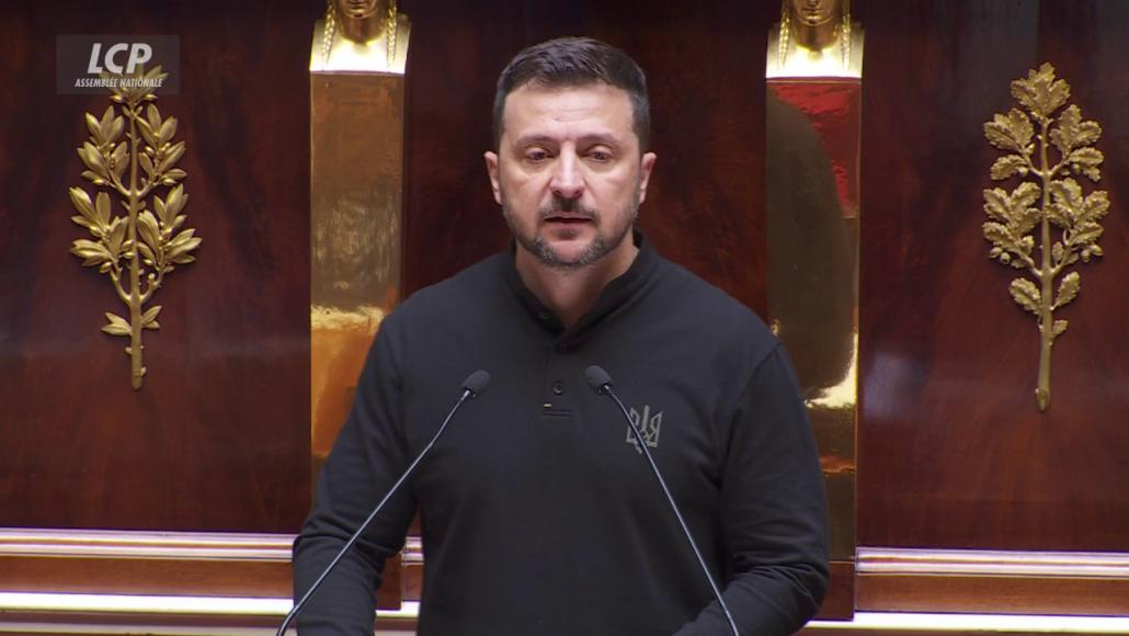
I feel very inspired by the logo of Ukraine. Today, Ukraine President Zelenskyy spoke to the French Parliament about the country’s needs in Paris. And he was wearing this black polo shirt with the Ukraine logo on it. I think this is really interesting because it’s not just a nation, it’s also a brand. It’s the first real nation branding in the world. It speaks to the freedom of Ukraine. I started to imagine what it would be like to see the French president wearing the face of Marianne, or the U.S. president wearing an eagle. We can use logos and brands to not only say something but also communicate a sentiment to the world.
If you’d like to read more from Creative Factor, find our latest stories here. Or looking to tell your brand story? Introducing Creative Factor’s Storytelling Studio.