Ksenya Samarskaya: Moving Type Out of Advertising and Graphic Design and Into a Bigger Cultural Conversation
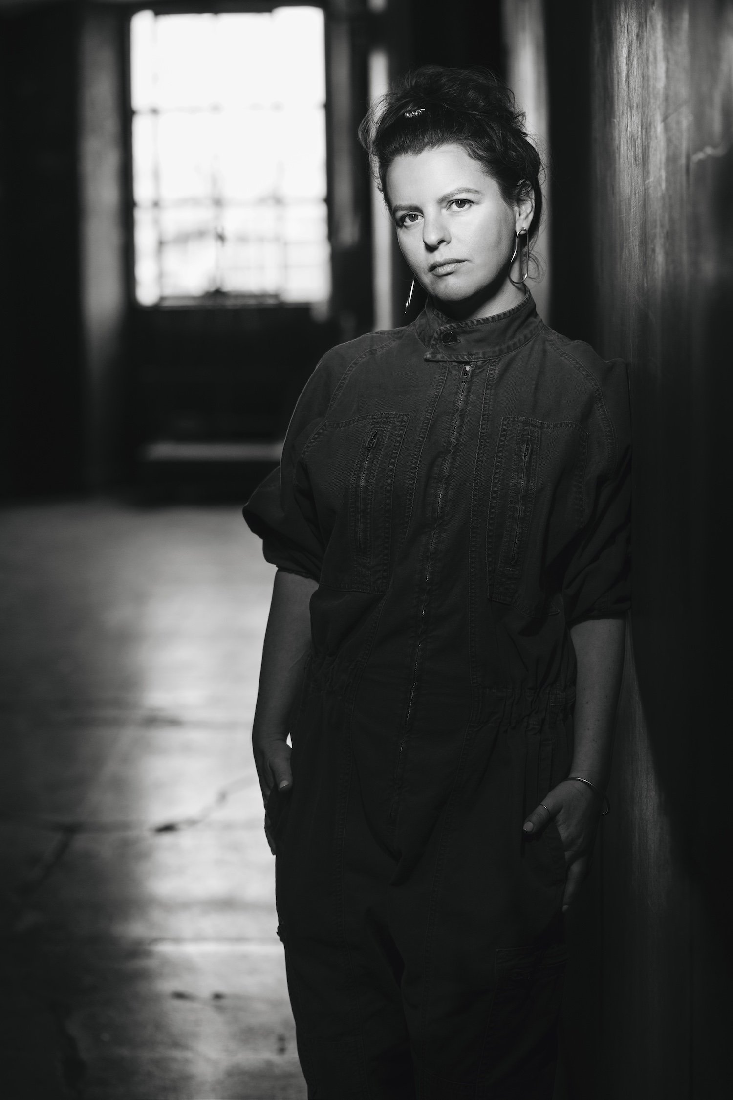
Ksenya Samarskaya is expanding how we think about and use type. All images courtesy of Type Directors Club.
Ksenya Samarskaya has a vision. The new managing director of the Type Directors Club—the world’s leading typography organization—wants to reposition typography, moving it out of advertising and design and into a much bigger cultural conversation. “I want it to be sitting on the shelf alongside language, alongside fashion,” says Samarskaya. “Typography is an incredible vessel to talk about much broader issues: culture, history, regionality, authority, autonomy, self-expression.”
It might sound hard to believe until you talk with Samarskaya about type, and the conversation flows from how emperors of the past created their own typefaces to control their countries to the ways local typefaces give cities their unique character. Then when she says you need your own personal typeface, it doesn’t feel like a far-fetched idea, but one that leaves you thinking, Yes, I do need my own typeface. Here, Samarskaya shares her vision.
Why do you want to move typography out of design?
Because type is much bigger than design. Graphic design exists in select spaces; in print, or interfaces. We spot it perhaps a few times per day. But we all use visual manifestations of language to communicate. And that’s both constant and continuous, from the time we are children to most of our daily exchanges today. People that don’t particularly care about graphic design still have to use type.
There are reasons rulers throughout history have been interested and tried to take control over the language, script, and even typographic form that their constituents used.
Tell us more about that last point.
Well, you have Peter the Great designing and reshaping Cyrillic in the early 1700’s in order to pivot his country toward—and position alongside—Europe; Latinizing Russia in ways big and small. And that same early fixation on the West, it hasn’t left—there are still tensions within ex-Soviet countries as to whether to use Latin or Cyrillic to set their languages. Various rulers and governments trying to posture their alliances via their chosen script. It’s fairly intentional. From 2017 to 2018, Kazakhstan kept appearing in the news for re-mapping their alphabet and introducing wide-scale use of apostrophes for vowels. Or we can explore all the myriad of ways dominant countries have mandated their alphabets on minority constituents. If you can control language you can control the fundamental connective root between people, you can control what they’re able to imagine.
Fast forward to today. What does that look like now?
Well, right now we have the effects of technology, of globalization. What kind of type-systems are easy to design fonts for, or easy to type with the way we’ve structured our keyboards or machines. On the globalization front, there are companies for whom it’d be easier to manage global populations if all of our typefaces looked the same, felt the same. It’s both a noble cause and an nocuous one. There’s a tension between ease and friction. It was during one of the TDC’s panels recently, where Antonio Alcalá was discussing the intentions of certain typography, and said “this is communication, but it’s not communication for you.” And I think that’s a powerful thing to keep remembering. Who is this communicating to? For whose ease? For whose comfort?
There’s a lot of interest in multi-script typefaces now, because so many companies are expanding their reach, they’re wanting to reach new communities and new consumers. And how do you do that? You do it with type, you do it with language.
Do you think more companies will design their own typefaces?
Oh, absolutely. It’s good for licensing, for brand ownership, for marketing. Skipping past the licensing point and toward the latter two, one way to think about typefaces is like a sponge. They start absorbing the connotations of what they’re placed around, such as when it was made or where it was used. That’s the way our memory and associations naturally work, right—we see a poisonous berry around a certain leaf enough times, we’re going to avoid that leaf. We see a type style in certain circumstances enough times, we’re always going to associate the two. So you have to understand the cultural landscape, because you're never just picking the typeface. You’re picking what’s behind it and what it might potentially remind different people of.
How do the economics of creating a typeface for a brand work for the type designer?
There are various factors, because it’s still incredibly time consuming to create a type family. The standard model in type commissions is that you offset some of the upfront costs in exchange for the ability to re-sell or license the typeface, or its derivatives, down the line. Every foundry has slightly different terms.
If we as individuals can be viewed as individual brands these days, should we all have our own typefaces?
Yes, absolutely. We all used to have our own handwriting, and now we’re typing those same messages. Why wouldn’t that same infusion of personality and layered nuance be able to be evoked? We have more personal fashion choices than ever before, more cuisine, and yet somehow with our writing we’re even more limited. That just seems like a glitch. We should all have our own typographic arrangements, set to match our mood and stage in life. Think of how much is communicated via voice—and, at the same time, how many miscommunications we have when texting or writing emails. Because the recipient doesn’t get very many hints at tone. How many unnecessary arguments come out of the fact that we’re limited to monotone? Typefaces could shift all that.
What’s one thing that has captured your interest in the world of type these days?
I've been fascinated with trying to find the range of typographical expression that sits outside the cannon. One of the ways I do that is by spotting signage around cities, walking around and spotting anything amateur, or anything left-over. You end up finding expressions of a letter that’s different from the mainstream fonts, and it gives you more to work with in the future: you go, yeahs, okay, that’s an acceptable form of expression. It’s like collecting words to mix into your future vocabulary. And each city or region ends up with its own accent, its own vibe.
Which cities do you feel have the most interesting type and vintage signage, and how do they use it to define who they are and what they stand for?
To find signage, a good starting point is somewhere with a history of high-traffic commerce combined with a slow shift to upgrade or replace the signs. I personally love small towns because they can be like time capsules, things from different eras will sit right next to each other. Road signs in far away places are often amateur, untrained hand-lettering by people with time, which is amazing, because you get care and precision without as much mimicry. The commercial areas around airports are often really good for unique mid-century and faded modernist logos and lettering. So I guess it becomes less about which cities, and more about…which part of the city are you going to go to when you get there?
What are the most misunderstood things about type?
That it’s binary; good or bad, right or wrong. That it’s a precise sport. That anything in it can be neutral. That legibility is one-directional and objective. That speed and ease are always benefits.
If you’d like to read more from The Creative Factor—such as Morten Bonde’s story about reinventing himself as a LEGO Art Director while losing his sight or Edése Doret: Inside the Mind-Boggling World of Private Jet Design—sign up for our newsletter.


