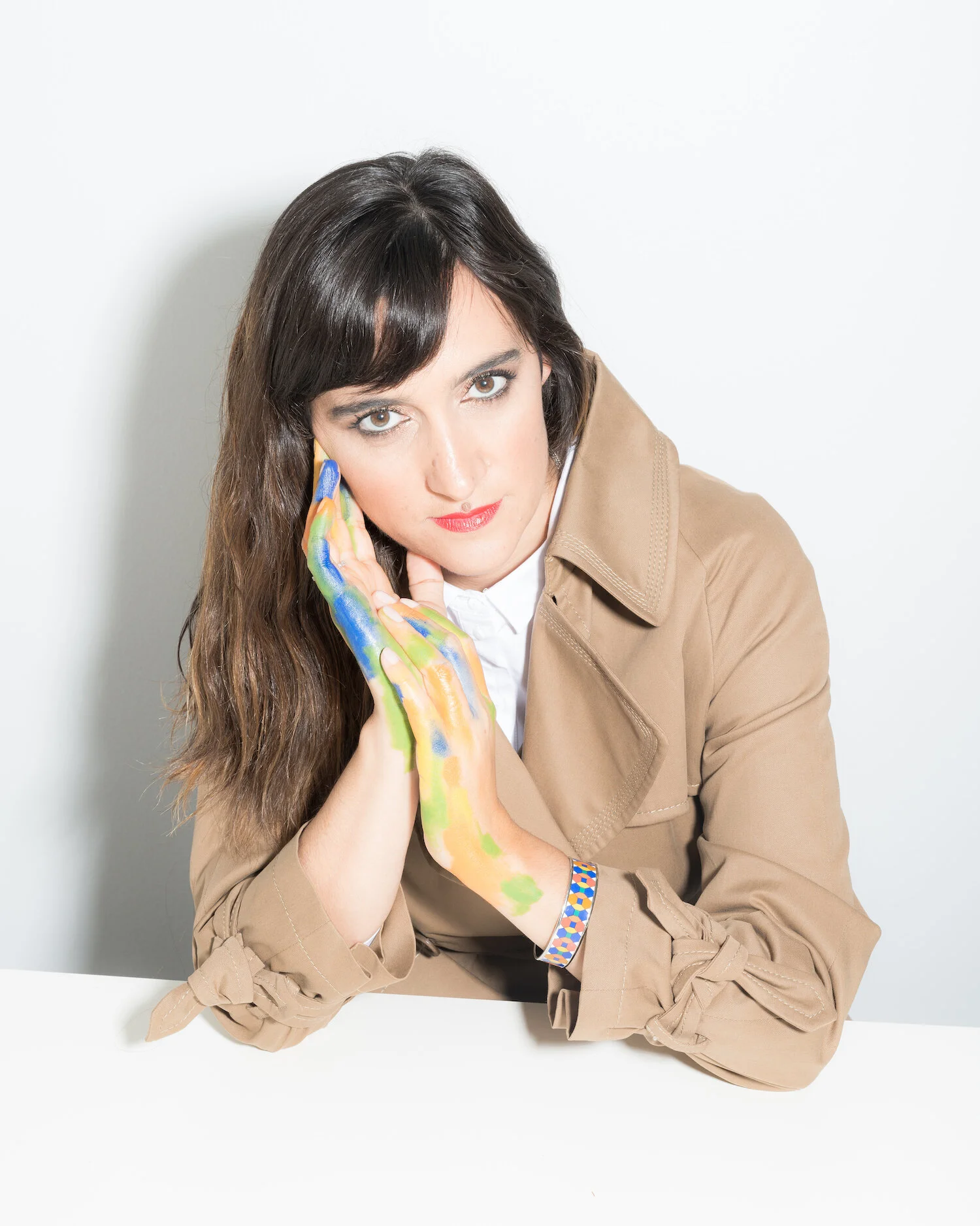
Joana Astolfi: Inspired By Imperfections
Joana Astolfi thinks in 3D and draws in 2D. All images courtesy of Astolfi.
Growing up in Lisbon, Portugal, Joana Astolfi spent much of her time at her father’s architecture studio and her mother’s art gallery. She was indecisive about which path to pursue until her father gave her this advice: “If you feel strongly about both, do architecture, as you have art in you — it’s your essence.”
So Astolfi evolved into a hybrid artist, architect, and designer who thinks in dimensions and views spaces as experiences capable of telling stories that transcend — and bridge — time, such as the window displays she creates for Hermès. “When I was a young girl I used to collect old photographs and invent the stories of the characters in the photos,” she writes. “I made drawings on top of old paintings and photos that I found in my grandmother’s house, never on blank sheets of paper — those scared me (and still do today)!”
Joana runs Studio Astolfi — one of the most unique studios in Europe due to its art/architecture foundation — and leads a 15-person team of artists, architects, and technicians who work on everything from a 200-structure housing project in Portugal to their first line of furniture and lighting objects. Here, Astolfi shares how she thinks in dimensions and weaves them together; why imperfections inspire her; and the biggest creative risk she took on a Hermès project.
Stretch the mind! Astolfi reimagined 800 old books as different wonderlands.
How did you start out on your own?
I started with a hybrid space. It was not a studio, and it was not a shop, but it had a lot of objects that I bought in flea markets and traded with other artists. It was a beautiful space in the center of Lisbon. I kept the door half open, so people could come in. My work table was a door on top of two stools. I had some local projects — a bar at the top of a big parking lot that was strange but worked well — and I was transforming objects and selling them.
How did you break in with Hermès?
I love the Hermès vitrines. They are me, creating narratives through scenography. One day I just walked in and asked to speak to the manager. She came down, and I presented myself. She said they were looking for someone new and there was a competition going on for it, but that I was late. Still, she said she would try to get me in, which she did. They liked what I presented and invited us to design the vitrines for one season. That summer we did eight vitrines for the Lisbon shop and seven years later we are still designing window displays for Hermès in Portugal and abroad.
What did you design that first year?
Every year Hermès has a theme and that year it was “metamorphosis.” We dressed a vitrine with a big shirt and one of the sleeves held a product. In another one, we took the carpet and transformed it into a big wave and on top of the wave there were shoes riding it. In another, we created a boat and it had an Hermès scarf for the mast. The more Hermès respects your work, the more they push you. Every year, the big challenge has been to continuously surpass and surprise myself.
Ride the wave… Astolfi’s first windows for Hermès in 2014.
What’s the biggest creative risk you took in an Hermès project? What worked? What didn’t? And how did it end up?
Every year, every season, every window display involves creative risks, as we are always pushing ourselves further. In Winter 2019, to celebrate this festive season, we created a narrative for Lisbon’s Hermès windows based on the world of “Magical Toys.” We focused our narrative on the beauty and joy of movement and motion. These windows involved a series of complex mechanisms that were extremely difficult to build, calibrate and operate.
We worked with five digital programmers who programmed the speed and rhythm of the movements, and built and adapted their motors. After the vitrines were set-up, we had to go back to the shop various times during this season to fix motors that suddenly stopped and had to be re-calibrated. It was a real stress and extremely demanding, but the result was incredibly beautiful. These windows were alive and each one was like a small performance telling an Hermès story.
There was also a time when I bought 800 old books with yellowish pages to make one season’s vitrines. All the ‘mise-en-scenes’ were built from these old book pages, creating complex scenarios using different paper art techniques like papier maché or carving out of the books and book covers. A lot of experimentation and trial and error took place here. We had to re-do some of the vitrines various times until we achieved the desired effect, but it was worth the time as the final result was very striking, poetic and meticulously crafted.
If the shoes fits: Astolfi’s clever and witty designs.
These days, it feels like we all have attention spans about as long as an Instagram story. How do you capture people’s attention to get them to view, explore, and engage with your installations?
I use conceptual twists a lot in my work so I like it when people have a smile on the tips of their lips as they look at my work! It means they got it! It means that they understood the twist, the narrative, and the humor behind it.
You describe your artworks as inspired by imperfections, mistakes, and error. What do you mean by that?
A lot of things happen during the creative process, and things go wrong sometimes, especially if you're using mechanisms that are more complex. When errors happen, I’m all about celebrating the beauty of the mistake. The mistake can open the door to a path that reaches the final result. I say embrace these mistakes.
How do you juggle multiple dimensions in your head? And then how do you weave them all together into something cohesive?
I usually think in 3D. When I imagine a space, an object, an art piece or a scenography, I think of the form, texture, materiality, color. I draw it in 2D, but I have to first imagine it in 3D in my head. Then, together with my team of artisans, architects, designers and technicians we physicalize it, giving it form, studying its proportions, color variations, material palette…that’s when the magic happens.
Members of the Studio Astolfi team, which is based in Lisbon, Portugal.
Did you ever imagine you’d be running your own studio at this level?
It never crossed my mind to have a studio with 15 collaborators. I always thought I was gonna be the mad artist alone in her studio doing the out-of-the-box projects that everybody thought, Wow, that's really avant garde. But who is she?
But I do want to continue to build on this language with my team, the cross between art and architecture, which is really unique in Europe. We are not the typical architecture studio. When I look at a space, I always look at it initially from an artistic point of view, and then together with my team, we work it conceptually, architecturally and structurally.
What did your father and mother teach you about architecture and art that inform how you create today?
My father is 85, an old school architect, like Bauhaus line. They draw everything from the chair to the drawer, all fitted in Frank Lloyd Wright style. Everything is thought to the ultimate detail.
I inherited from him that it’s all one story. When you enter a space, the thread must be continuous. It has to all tie in together. My father was designing things at a much bigger scale, like hotels with 200 rooms and even hospitals and big factories. He’s a social architect, and he’s also an engineer, so he can structure things in a very broad way. He is also a risk taker: Step a bit in front of yourself. Don’t be afraid to take that step. If that goes wrong, work around it. That is his Brazilian side.
My mother, even with having her art gallery, never picked up a pencil to draw one line in her life. That’s incredible because it’s her sensitivity that got me. The way that she interiorized and felt art. Her eyes, her vision, how she looks at art, feels art, and talks about it. We are all a story and my parents are very much part of mine.
If you’d like to read more from The Creative Factor, check out Morten Bonde’s story about working as a LEGO Art Director while losing his sight and how Planned Parenthood Senior Creative Director Elizabeth Bawol designs to advance the organization’s mission.


