Designing for Mistakes: A Fix for Where Social Media Goes Off the Rails
Images by Amanda Tuft.
Alexis Lloyd and Matt Boggie met while they were working together at the New York Times R&D Lab, a division of the news publisher devoted to experimenting with how emerging technologies can be used in journalism to enable new forms of storytelling. While there, they found themselves looking for different signals—be they opinions, stories, and news articles—that when taken on their own might not be monumental, but lend themselves in aggregate to bringing a larger picture into focus.
A few years later, both having moved on to other jobs—Alexis is the VP of Product Design for Medium and Matt is currently Chief Technology and Product Officer at The Philadelphia Inquirer—the pair founded the Ethical Futures Lab, with its newsletter—aptly named Six Signals—as a way to hold up a lens to both themselves and the tech industry. “We are trying to get people to think about the ethical choices behind the technologies they use and the ways in which those technologies are put out into the world,” explains Matt. “To consider those choices as they’re being made, and to ask: Is there a better way, a different direction, or a more preferred outcome that I want here?”
Matt and Alexis discuss how we might have different conversations online, why we need to design for mistakes, and—gasp!—what we can learn from Tumblr about deterring negativity online.
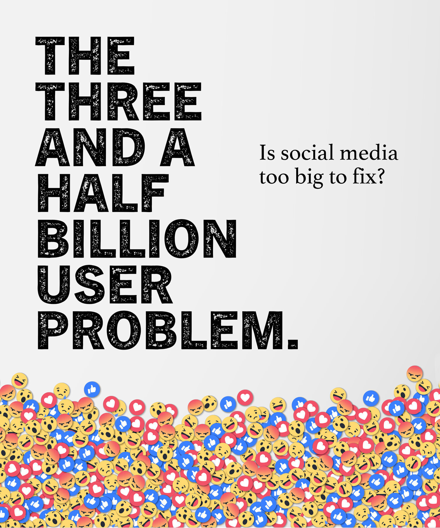
Societal norms start to break down really quickly online. Are we simply showing our true selves over social media, or is there something intrinsic to these platforms that brings out the worst in people?
Alexis: I think part of this is scale. There are a lot of social norms that work up to a certain scale, where you have a sense of individuals in the room with you—whether that room is virtual or physical. Beyond a certain scale, it’s easier to dehumanize people. Or rather, harder to humanize people.
Matt: On a day-to-day basis you associate with people who you feel are a lot like you, and you disassociate with people who you disagree with. It’s human nature to be a little tribal, and these tools make that easy. Scale is a huge part of that. If I’m shouting into a crowd, I don’t necessarily put any identity behind the faces I’m yelling at. I also don’t necessarily think I’m ever going to see these faces again, so there’s really no cost to it. Whereas if I’m in a smaller group of a hundred or few hundred people who I have to interact with in the future, and who I have to create a social bond with, I’m going to behave much differently in that situation.
Alexis: This is why I’m interested in experience design, because this is where you tend to encourage or discourage certain kinds of behavior in both detailed and subtle ways. And I’m curious about the ways that happens. Frank Chimero wrote a nice essay about the design of reactions on social networks. His perspective was that positive reactions were built in as a simple, undifferentiated feature—like clicking a heart icon— and they take up less visual and mental space than negative reactions. Negative reactions are both more visually prominent and more specific. And his quote was “one heckler with incisive comments can block out the generalized applause of many more people.”
There are interesting decisions about the way UX design and UI design influences or encourages different kinds of social behaviors. Tumblr specifically made it so that, if you wanted to comment on someone else’s post potentially negatively, you had to re-blog it. You had to take that quote into your own space, and basically corrupt your own space with your negativity rather than being able to graffiti up their space.
“Tumblr specifically made it so that, if you wanted to comment on someone else’s post potentially negatively, you had to re-blog it.”
From a user experience standpoint, how do we have different conversations online?
Alexis: It’s one of the things Matt and I have talked a lot about: Are there ways we can solve for the scale problem, at scale? How do you create smaller communities within larger communities, that lead to more personal connections and theoretically less abuse? What are the kinds of defaults that you can set up that encourage positive behavior, and make it harder to behave negatively?
Matt: There is a great video that describes the difference between the ways Vision Zero is being implemented in the United States versus the way it’s being implemented in Europe. In the United States, they are being designed such that, if everyone follows the rules all the time, everything will work great. And they’re being designed in Europe in such a way that’s saying, people make mistakes. The infrastructure is designed in such a way that making mistakes is both more difficult and has a lower impact.
For example, if you have a 20 mph speed limit on a street in the United States, there’s a sign on the sidewalk that says “20 mph” and that’s it. In some residential areas in Amsterdam, you’ll find that the road will actually zig-zag a bit, and they’ll have curved paths at the crosswalks that you have to swerve a little to the left or right, or they’ll alternate which side the parking is on, so that you have to pay attention to the obstacles in your way. You quite naturally slow down because you need extra reaction time to navigate.
Also bike lanes: If we want a good bike lane here in New York, it’s green paint, for the most part. Maybe you’ll get some plastic traffic delineators that you can easily plow through if you’re in a car. But in parts of Europe not only are the lanes separate, but they are often at different elevations, with different textures of materials between. So you might find cobblestones and an ellipse separating the automobile roadway from the bike roadway, and again from the bikes to the sidewalk. Each class has its own space, and there is a clear spot at which you transition from one space to another, and that transition is difficult. You have to bump up on a curb or make a significant change in your direction in order to do the wrong thing.
Alexis: Bringing that back to the technology world, the rhetoric of Silicon Valley has been a very optimistic, “this is going to do great things, we’re going to connect people across the world.” And it is very much that American approach to Vision Zero, which is that we’re going to assume that everyone is going to do the right thing, and then maybe we’ll build in some guardrails for people to prevent things that we see people doing what we don’t want them to do.
This, versus an approach where it’s really important at the beginning of a process to identify what the unintended consequences might be and to design an experience with that in mind. It is a really different approach to how we think about what we do with technology.
“Facebook would still be a fine place if it were still the place where you post photos of your vacations.”
Would we ever leave our social networks behind?
Matt: There is always going to be some natural impetus to connect with other people in some way, and where social has really gone in a different direction is in the attempts to monetize that particular interaction. Facebook would still be a fine place if it were still the place where you post photos of your vacations and invite your friends to events. Where it started to go south was when all that data was then turned into something that could be monetized, and sliced and diced for the purpose of serving commercial messages to people. And further, saying that any message could be a commercial message—even ones that are blatantly, provably false—can still be distributed and targeted at people. Those choices have a huge impact on what the platform can do.
This article was originally posted in December 2019 and has been updated. If you’d like to read more from The Creative Factor—such as why we should allow for more irrational thinking in the world or how we solve for our new relationship with the physical world, subscribe to our newsletter.


