Oki Sato: How to Design a Train

High-level design on a high-speed train. Images c/o nendo.
Planes, trains, and automobiles are coveted items to design. Most people never have the chance. The team at nendo in Japan designs something new just about every day, so the odds were better for them. (And it helps that they do face-melting work — they designed the Tokyo 2020 Olympic cauldron, among other notable projects.)
In 2018, Nendo founder Oki Sato and his team undertook the design project to reimagine the interior and exterior of the new fifth generation of TGV, the high-speed train (186 mph) that connects cities throughout France and abroad, operated by SNCF Voyageurs since 1981.

The prolific designer, at rest.
Sato started by viewing the train as a “flowing river” (flows over the tracks along vast terrain) and used the ideas of smooth flow, depth of the river, soft pebbles in the riverbed, and even floaty and bubbly surface of the water as design inspiration. Soft shapes are used throughout, from the forms of the seats to the banquettes in the bistro to the individual lighting elements that illuminate the tables. Colors are darker towards the ground and become lighter as the eye rises through the carriage, up to the lighting elements in the ceiling. Bold elements, like the sparkling yellow lamps and red and yellow seat pockets, provide a contrast.
Here, Sato describes what went into this seven-year creative effort, how the constraints of a high-speed train led to unexpected design choices, and why he and his team start all projects — even ones this big — by sketching. (Sato generously conducted the interview in both English and Japanese.)


The seats, lamps, and colors were all given a refresh by nendo.
These are fifth-generation trains. What were the big things that needed to be improved in these that would elevate the rider experience?
There was a complex mix of both technical challenges — like increasing seating capacity per car, flexibility in train formation, reducing environmental impact, and ensuring accessibility — and emotional challenges related to passenger comfort and well-being. We needed to address all of them.
What I was particularly conscious of was ensuring that the design resulting from solving these various issues didn't end up looking purely “technical.”
Just because the train runs fast doesn’t mean passengers want an F1 car-like design suggesting speed. And the more compact spaces resulting from increased capacity shouldn’t feel cramped.
The colors and shapes of various components were derived from this perspective. It might be about valuing a sense of “nostalgia” to mask the “newness,” or perhaps utilizing a sense of “ordinariness” to avoid making it feel too “special.”
一車両における座席数の容量アップや、車両編成の柔軟性、環境負荷の低減、バリアフリーといった技術的な課題と、乗客の心地よさや快適性といった情緒的な課題の、どちらもが複雑に存在し、それら全てを解決する必要がありました。
自分が特に意識したのが、こうした様々な課題解決をした結果、「テクニカル」な印象のデザインにならないことでした。
速く走るからといって、F1カーのような速そうなデザインは乗客から求められていませんし、
容量アップのためにコンパクトになった空間を、窮窟に感じさせてはいけません。
様々な構成要素における色や形状などはそうした視点から導いています。
それは、「新しさ」をマスキングするための「懐かしさ」を大切にする感じであったり、
「特別」を意識させないための「普通」を活用する感じかもしれません。


Unlike a brand refresh, these designs are made to stand the test of time — they won’t be replaced any time soon.
Designing the interior and exterior of an iconic train seems like a dream project. What were the biggest constraints you had to navigate? And what were some of the ways you leaned into or worked around these constraints?
I personally had never experienced a project that took seven years. While it might seem like a dream project, in some ways, it felt closer to a nightmare. (Laughs.)
Regarding constraints, it wasn’t about one major restriction, but rather a continuous process where subtle constraints kept pouring down day after day.
Therefore, I tried not to neglect the finer details, focusing on resolving each issue carefully, one by one. Essentially, it was the same stance I take with my usual projects, like small industrial products.
For instance, if we needed to perforate a surface for weight reduction, I would thoroughly examine the shape and spacing of the holes to create a design that brings a sense of rhythm to the train interior.
From an accessibility standpoint, the train doors needed a more vivid, high-contrast color than the main body. However, by making the doors burgundy against the light gray body, they actually became an accent for the exterior, which is something I personally quite like.
自分自身、7年もかかったプロジェクトは過去に経験がなく、夢は夢でも、どちらかというと悪夢に近い体験だったように思います。笑
制約もまた、ひとつ大きなものがあるというわけではなく、微細なものが日々降り注ぎ続けるようなプロセスでした。
そのため、自分自身もできるだけ細やかなディテールを疎かにせずに。ひとつひとつ丁寧に解決することを意識しました。
つまり普段の小さな工業製品などのプロジェクトと同じようなスタンスです。
例えば、軽量化のために表面に穴を空けなくてはいけない状況なのであれば、その穴の形状や間隔を徹底的にに検証して、それが車内にリズム感を生むようなデザインにしたりしました。
バリアフリーの観点から、車体のドアには本体よりもビビッドでコントラストの強い色が必要でしたが、明るいグレー色で構成された車体に対してバーガンディー色のドアにすることでむしろ外観のアクセントになった点は個人的にとても気に入ってたりします。

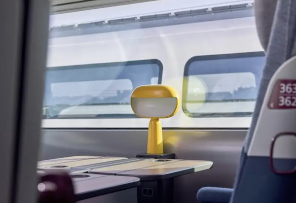
The attention to detail makes even the most routine elements — the lights — pop.
What is the hardest thing about designing seats and tables that will be in a training moving at 200 mph? And why?
The biggest difference from designing regular furniture was the “load” or weight constraints.
To achieve the train’s speed and stable operation, adjustments down to a few grams were essential. Furthermore, reducing weight often compromises strength and durability, so balancing these aspects was extremely challenging.
For example, the fabric used for the seats is a newly developed 3D knitting material that is lightweight yet highly durable and strong. This material emerged from addressing these background challenges.
普段の家具のデザインと大きく異なったのが「荷重」でした。
列車の速度と安定走行を実現するためには、数グラム単位の調整は不可欠です。
さらに、軽量化を進めると、強度や耐久性が落ちてしまうため、このバランスには相当苦労しました。
例えば、シートに採用されているファブリックは新たに開発されたもので、軽量ながらに耐久性や強度が高い3Dニッティング素材となっています。この素材も、こうした背景から生まれましたものです。
Your projects always start with a sketch, no matter how complex they are. Why do you start with a sketch, and how does that inform what you ultimately design and make?
No matter how complex or large-scale the final output might be, I believe the initial idea should always be simple.
Projects are constantly shifting and changing. Things rarely go exactly as planned, and sometimes project members can lose their way.
In such moments, a sketch embodying that simple initial idea acts like a “lighthouse,” serving as a guidepost. My sketches aren’t necessarily skillful, but this is the reason why I always draw them.
最終的なアウトプットがどれほど複雑であったり、規模が大きかったとしても、最初のアイデアは常にシンプルでありたいと考えています。
プロジェクトというものは常に移ろい、変化を繰り返すものです。
当初の予定通りにいくはずもなく、時にプロジェクトメンバーが道に迷うこともあります。
そんな時に、このシンプルなアイデアを体現するスケッチがまるで「灯台」のような存在となり、道標となってくれるのです。
スケッチは決して上手ではないですが、必ず描いているのにはこうした理由があります。
You started this project in 2018 and you obviously can't “test” your seats and tables in the actual trains. So where and how did you test your design iterations?
We created a full-scale mock-up replicating the train car in the French suburbs, where we repeatedly tested the usability of the seats and tables.
The only major obstacle during the project was the COVID-19 pandemic. Travel restrictions to France made things difficult, and dealing with unfamiliar online meetings was stressful. There were also periods when we couldn’t conduct tests using the mock-up.
However, thanks to collaboration with nendo staff based in France and schedule adjustments, I feel we managed to overcome these challenges.
フランス郊外に車両を再現したモックアップを制作し、実際に座席やテーブルの使い勝手は繰り返し検討しました。
プロジェクトの最中の唯一の大きな障壁はコロナ禍でした。
フランスへの渡航が制限され、慣れないオンラインミーティングのやり取りはストレスを伴いましたし、こうしたモックアップを使った検証もできない時期もありました。
ただ、フランス在住のnendoスタッフとの連携や、スケジュールの見直しなどによって、なんとか乗り越えることができたと感じています。
nendo creates something new almost every day. How are you and your team so prolific and able to design so many items, big and small?
Firstly, regarding the “quantity” of design work, I think it purely comes down to my passion for design.
“Passion” might sound cool, but in Japan, people like me are often called design “otaku” (nerds/enthusiasts). (Laughs)
Whether it’s a design for the French government or a small job requested by an elderly neighbor, there's no difference to me. I always find something interesting from a design perspective and end up enjoying the process.
Regarding the varying “nature” or “scale” of different designs, I believe that as long as they are things people use, there isn’t a huge difference. Of course, technical adaptability is always required, but in terms of ultimately providing some kind of emotional value to the user, the nature or scale of the project doesn’t concern me much.
まず、デザインする「量」については、単純に自分のデザインへの情熱でしかないと思います。
「情熱」というとカッコいいですが、日本では自分ような人間のことをデザインの「オタク」と呼びます。笑
それが例えフランス政府のためのデザインであっても、近所のおばあちゃんに依頼された小さな仕事であっても、自分にとってそこに何ら違いはありません。
必ずそこにデザイン的な面白みを見出し、楽しんでしまうのです。
様々に異なるデザインの「性質」や「規模」ついても、人が使うものである以上そこに大きな違いはないと思っています。当然、技術的な対応力は常に求められますが、
最終的に受け手側に対して何かしらの情緒的価値を提供する、という点においてプロジェクトの性質や規模はあまり気になりません。

Join more than 30 leaders from top organizations, including Spotify, Disney, Shake Shack, Target, NASA, Cannondale, Hearst, Flatiron Health, Roblox, Clay, Paramount, andThe Aspen Institute.